Educating home owners about sustainable heating alternatives
The client SolarRegina GmbH is a mid-sized local german company for environmentally friendly solutions in heating and air conditioning technology.
This work was part of my final graduation project, meaning all text and page-content was pre-determined and wasn't allowed to be edited.
- Redesign of the full website
- Development in HTML, CSS & Javascript
- Design -> 10 days
- Coding -> 2 weeks preparation
- Figma
- Adobe Illustrator
- Adobe Indesign
- HTML, CSS, Javascript
Problem & Task
The website needs to have the following features, while also maintaining a high standard of usability and visual appeal:
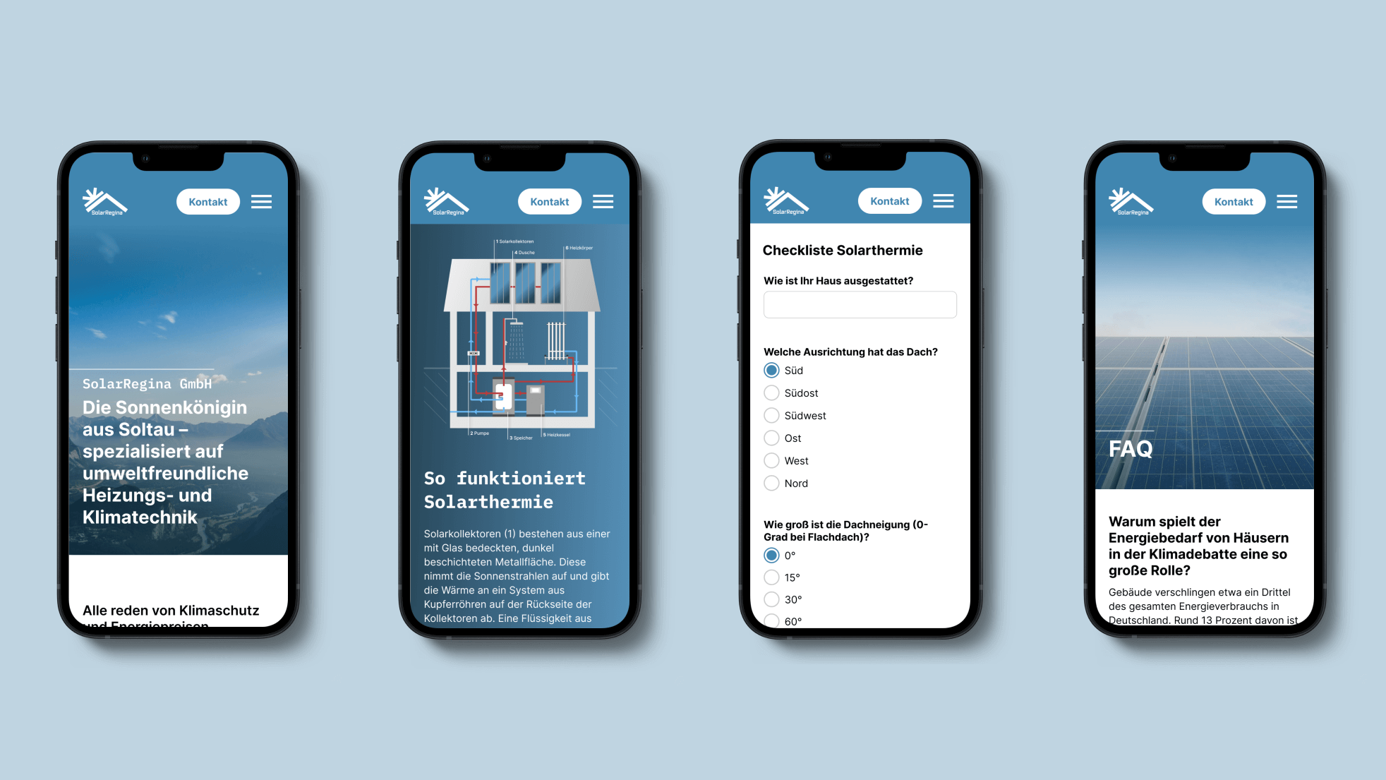
- Responsive Layout (Progressive Enhancement)
- Image-Slider
- Illustration about solar thermal technology
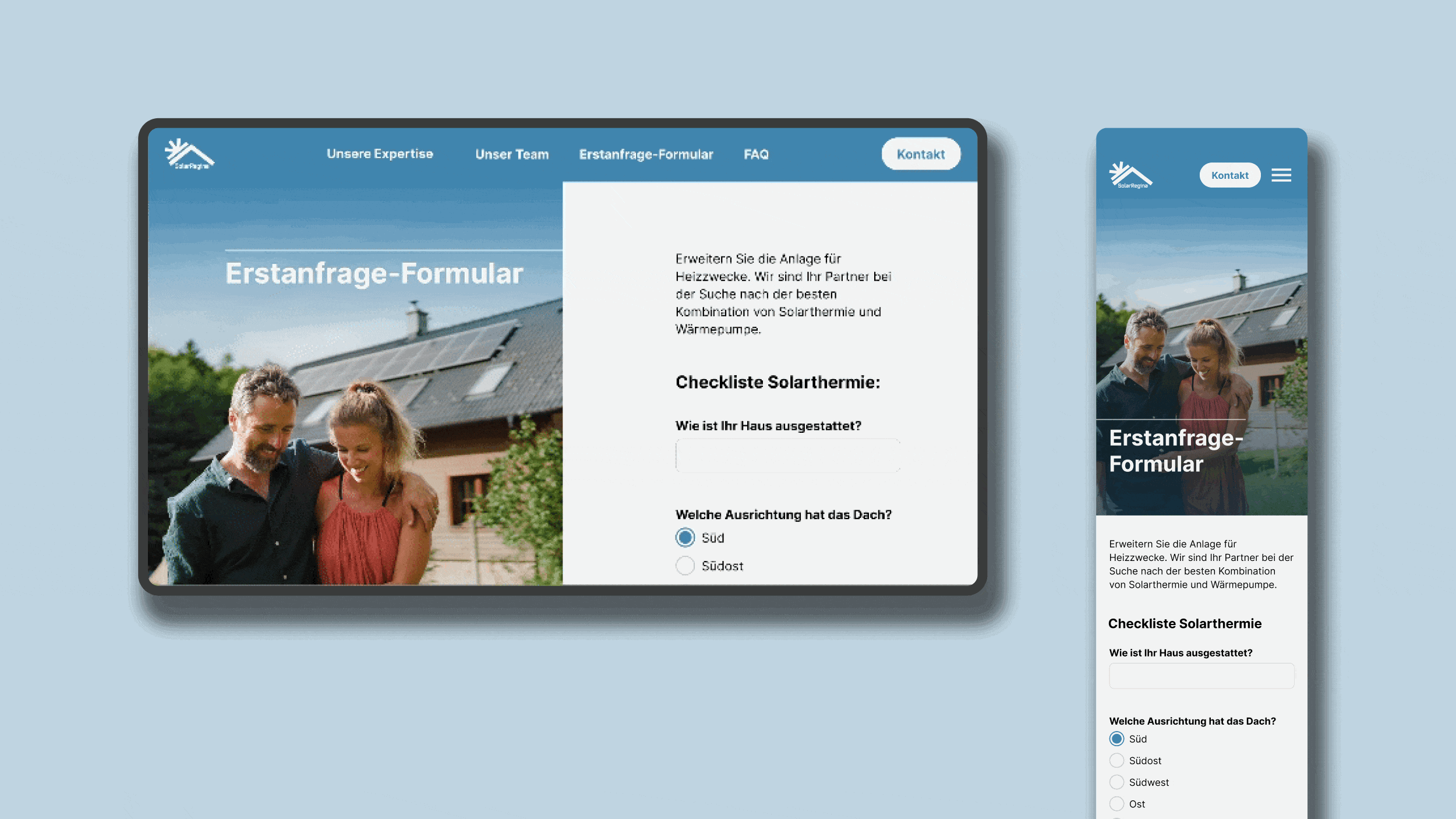
- functioning contact form
Goal
Design an engaging website, that informs its visiters about the possibilities of sustainable heating solutions, while being quickly feasible through "hard-coding" it.
Moodboard
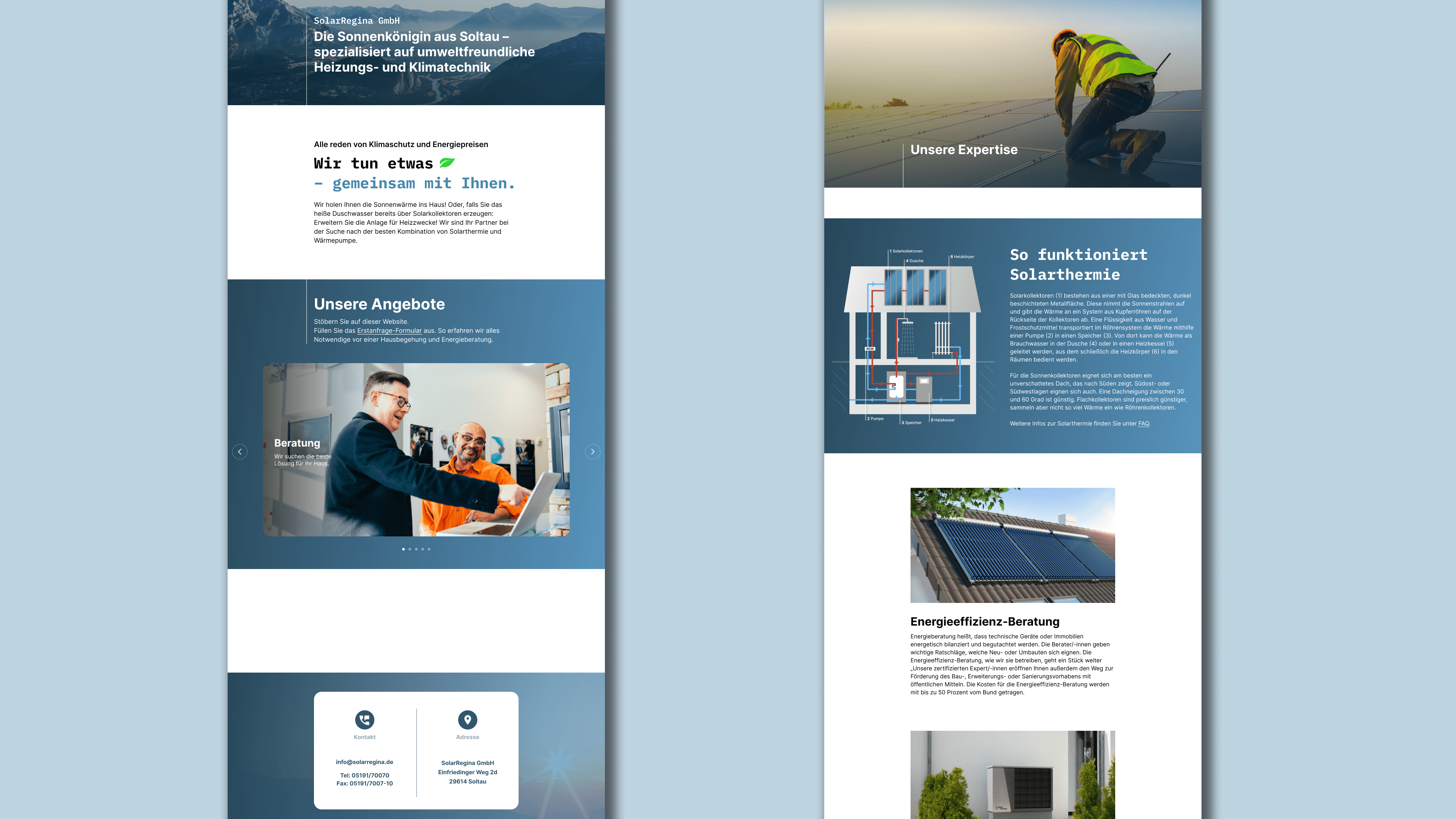
As part of the ideation phase I researched similar companies and competitors of the client, in order to find inspiration and discover well established web-patterns in this sector to ensure that target users feel familiar on this website too. I focused on wide nature shots to create a connection to emphasise a closeness to nature through sustainable energy technology.
For the colors I decided stay close to natural shades of blue and brown, combining them with a warm orange to further establish this relationship between nature and tech.
Responsive Grid
The page grid is structured according to the principle of "progressive enhancement". While there are only two options for content width (text and full screen) on mobile devices, additional options are added dynamically as the screen size increases. This means that the width of text can be limited for improved readability, while images and videos can benefit from more space.
-> Demo page
Wireframe
After creating a basic outline-sketch on my iPad to structure the given content into individual sites, I moved on to create low-fidelity wireframes using Figma. The wireframes allowed me to refine the design further, providing a more concrete representation of the overall layout, structure, and functionality of the app. By creating wireframes, I was able to experiment with different design elements and test the usability of the interface before investing time and resources into a more high-fidelity design.
Style Guide
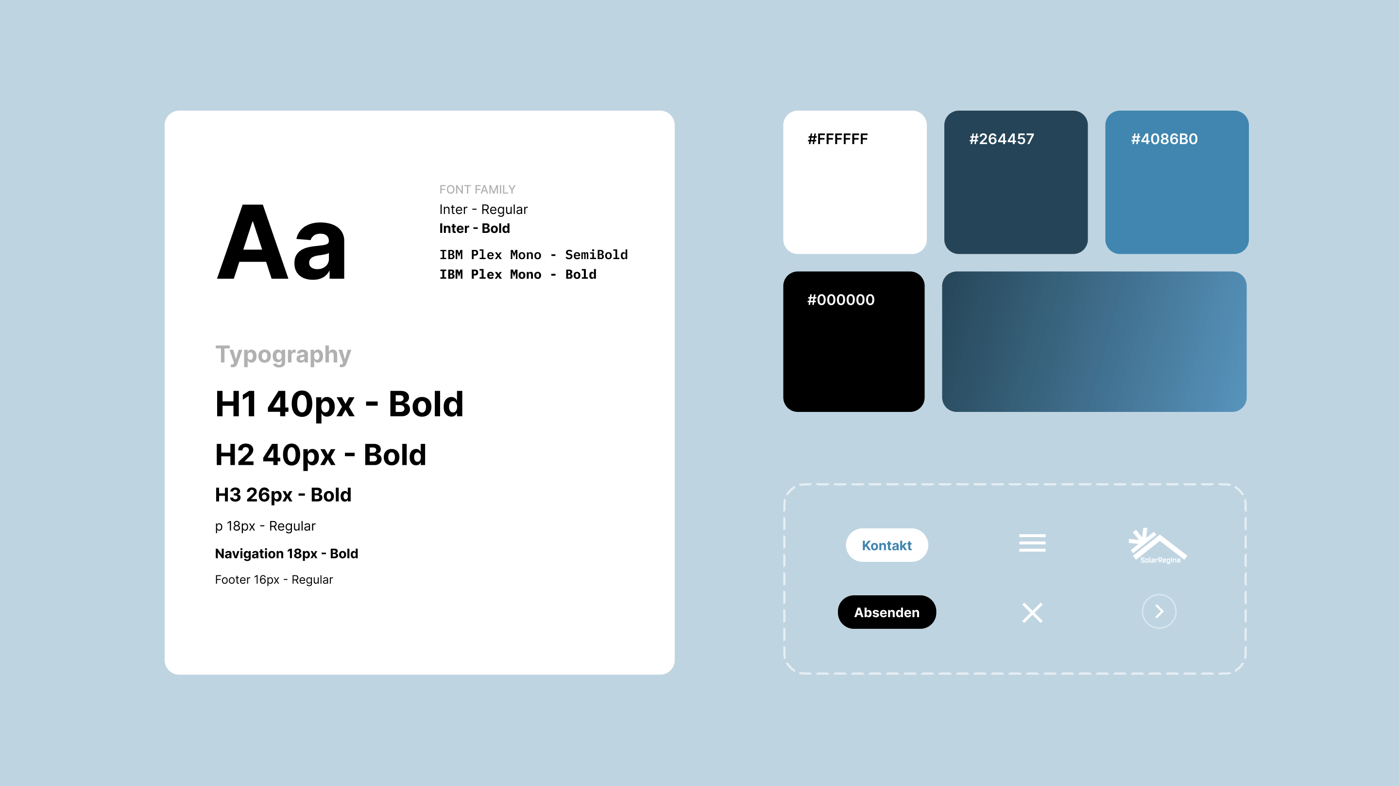
The color selection aimed for a professional and modern appearance reflecting the company's future-oriented industry. A light blue was chosen for its calming, nature-inspired qualities. Paired with classic white, it creates a bright contrast, that also stands out perfectly on a blue gradient background to enhance readability.
For the body text the font "Inter" provides excellent readability combined with a minimalistic style that further adds to the minimalistic and modern design of the whole website. The font "IBM Plex Mono" serves as a contrast font to the main font and helps individual headlines and text to stands out more.
UI elements, such as CTA- and icon buttons all follow the established color guide integrading themselves ideally into the websites appearance. They all follow a tap target size of 48px to ensure optimal usability for desktop and mobile users.
Imagery
The goal was to give images as much space as possible to achieve an eye-catching effect on the sites user, while also showcasing the companys work in an impressive way. Therefore all standalone images are in a 16:9 aspect ratio. The required image-slider is placed so that on smaller screen sizes navigation and pagination are still visible until the navigation arrows are no longer required on mobile.
The individualised info graphic about solar thermal energy is put into more focus by pairing it with the related paragraph and giving the whole section its own background color.
Navigation
While the desktop navigation is a quite simple 1-level navigation, it is paired with a CTA button, linking to the contact page. This way it always offers the possibility to direct users to contact the client once they feel like they have informed themselves enough to receive further consultation.
On mobile the navigation collapses into a burger menu while keeping the CTA button still accessible inside the header to keep it reachable at all time.
Contact form
In the desktop view, a fixed image occupies the left side of the viewport, extending vertically across the entire height and horizontally covering half of the viewport, while an interactive form remains scrollable on the right half, with the form's width limited to half of the "min-content-width" to ensure clear label text wrapping and input length while maintaining optimal responsiveness on smaller screens.
The form inputs use different shades of the blue primary colour to additionally indicate hover and active states.
Result evaluation
I am very satisfied with the outcome, given the limited framework conditions.
Specifically the quite minimal UI, that combines strong imagery with clear functionality, can be applied to larger and complex websites.
Review & Outlook
Since the page navigation and texts were already given, I strongly question the logic and context behind it. Even though there is often a requirement list provided by the client, content and technical features should always serve a key goal, which is not fully clear from the requirements. A more comprehensive briefing about the business objectives and user research would enable a more thorough and founded execution.