Optimizing the mobile registration experience for Business Students
The IHK WissenAkademie, located in Eastern Bavaria, serves as a regional provider of continuing education. Their offerings include IHK-certified programs, such as seminars, certification courses, and practical study options. Its hybrid approach combines traditional classroom settings with modern technology for business professionals and entrepreneurs.
Before coming up with a whole new web appearance, the client wanted to be presented with an updated mobile design, showing possible solutions to their biggest user issue.
- Redesign of 3 mobile web pages & the registration form
- All designs combined -> 1 month
- Adobe XD
Problem
The client informed us that users were struggling with navigating within their many different course options, which caused a high registration bounce rate (users cancelling the sign-in process at the beginning or the middle of filling out the registration form).
Task & Goal
Redesign of the mobile UI Design in order to improve user experience, leading to an increase in course registrations.
Only applying styling edits that are easily and low-cost feasable within CSS and HTML alterations.
Usability issues
We determined that the websites usability suffers under different structural issues and unfortunate UX patterns, while its outdated interface was also hurting brand appearance.
In order to limit time and resources, we focused on the most important user touchpoints for user registration, why we identified in the following pages:
Homepage -> Courses overview page -> Course detail page -> Shopping cart -> Registration form process
The following design issues were identified:
- weak color contrasts
- unreadable font sizing
- inconsistent spacing
- illogical content structure
- unclear content navigation
- weak accessibility elements
- uncommon UI/UX patterns
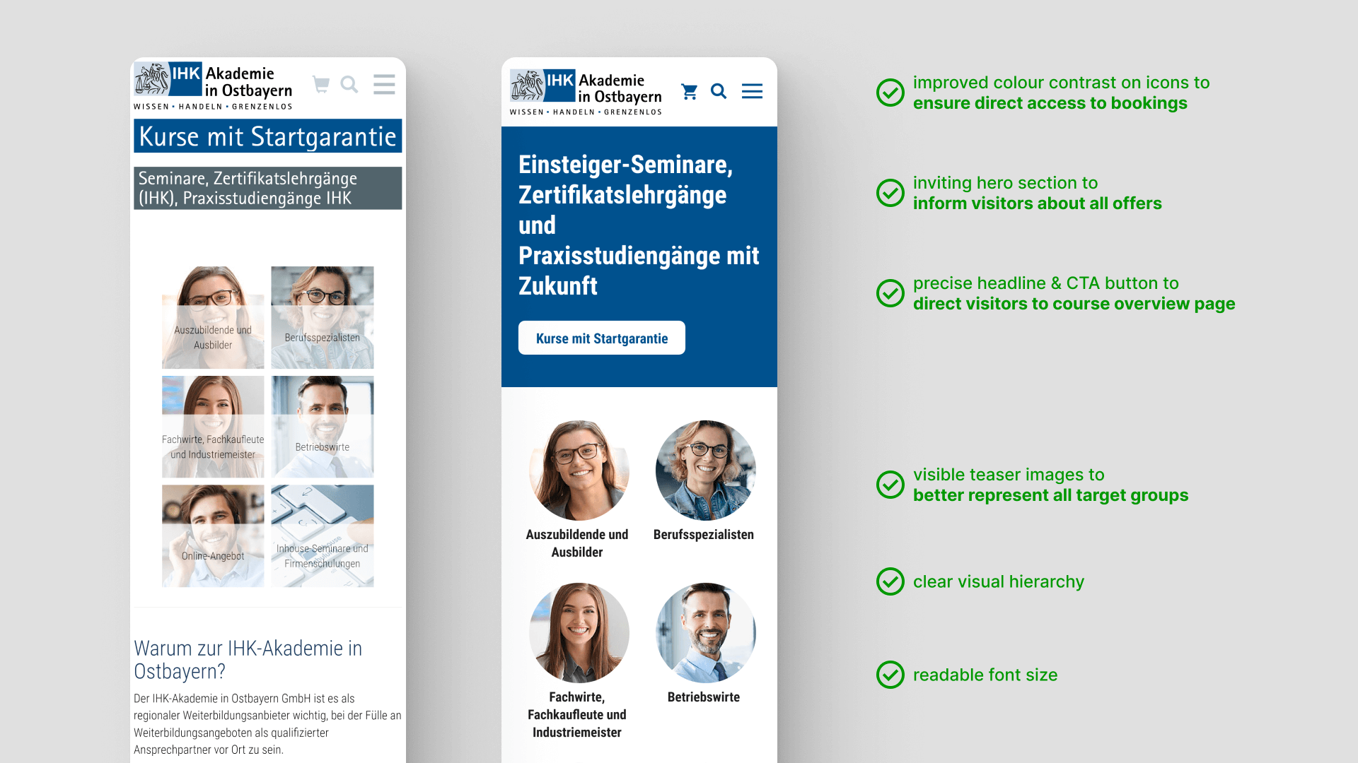
Homepage
The homepage is the ideal opportunity to give users a competent and professional fist impression of your services. By fixing usability issues, while also giving the interface a more modern appearance, we decided to provide two solutions for two different groups of interested students:
the group which already knows in what type of program they are interested, will be guided directly through the CTA button in the hero section to an overview page of all available programs. The other group, which is not informed at all, has the possibility to filter through the different represented professionals in the teaser images.
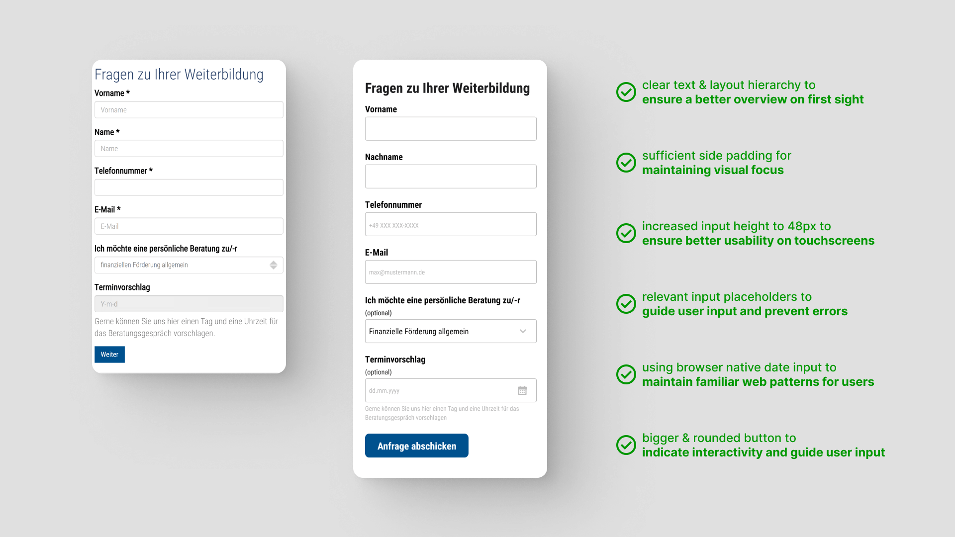
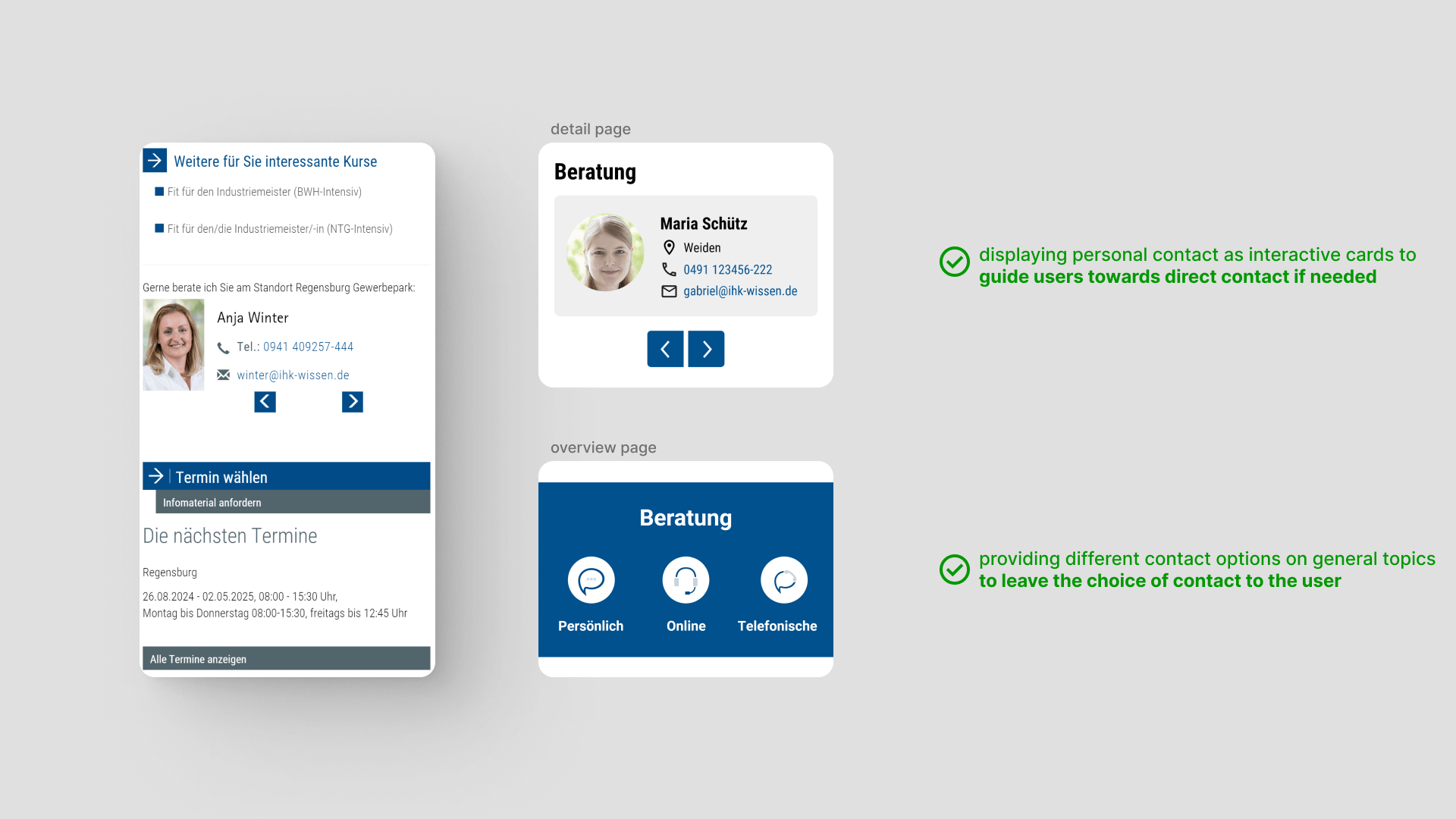
Question form
To encourage interested parties to contact the academy for a direct consultation, the contact form is directly embedded on the home page. They have the option to recieve information about a specific program and even leave a specific date for a personal consultation.
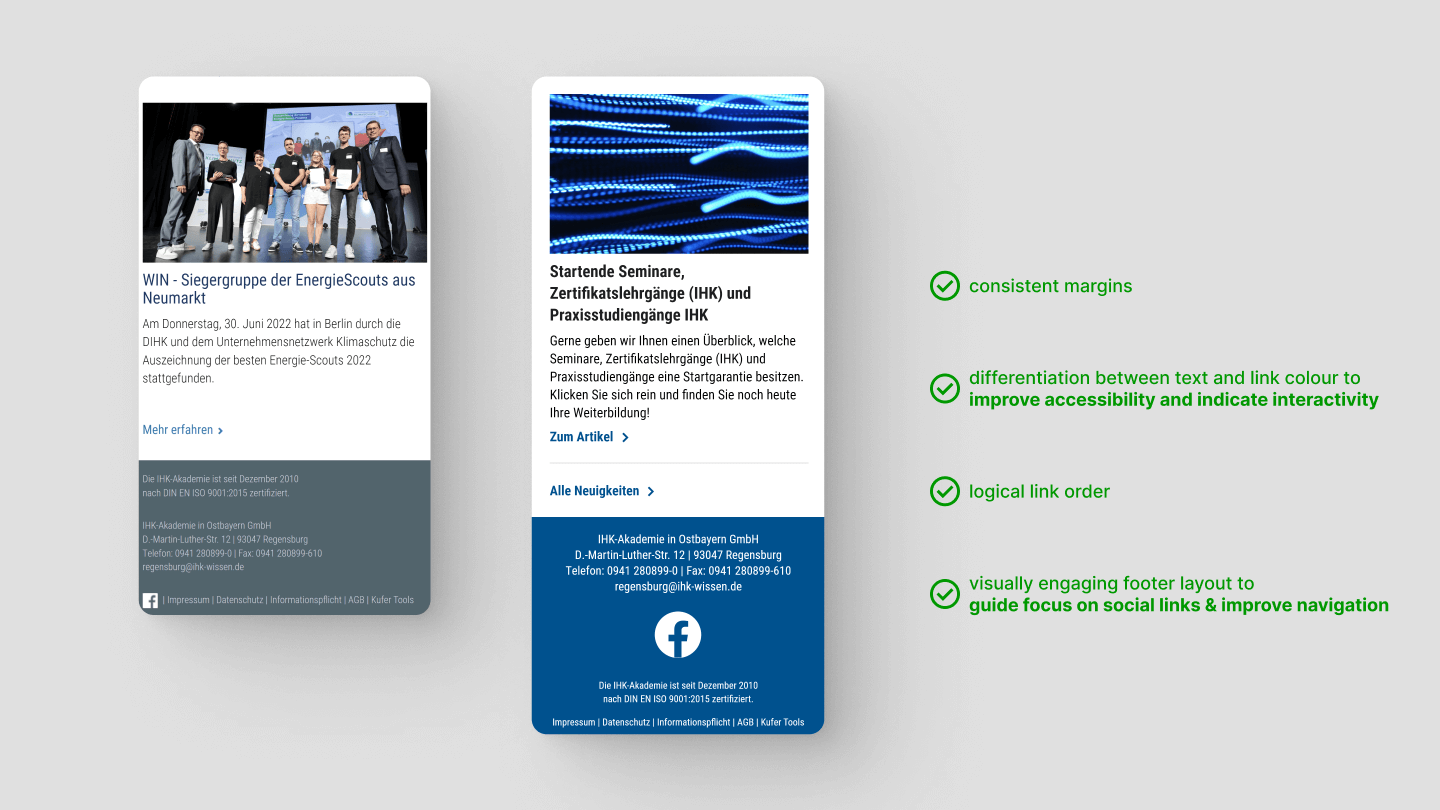
News & Footer
Besides restructuring the UI a new link, which forwards to the overview page for all news article, was added at the bottom of the three newest articles, so users, which are further interested in more news, have the option to get directly there with only one click.
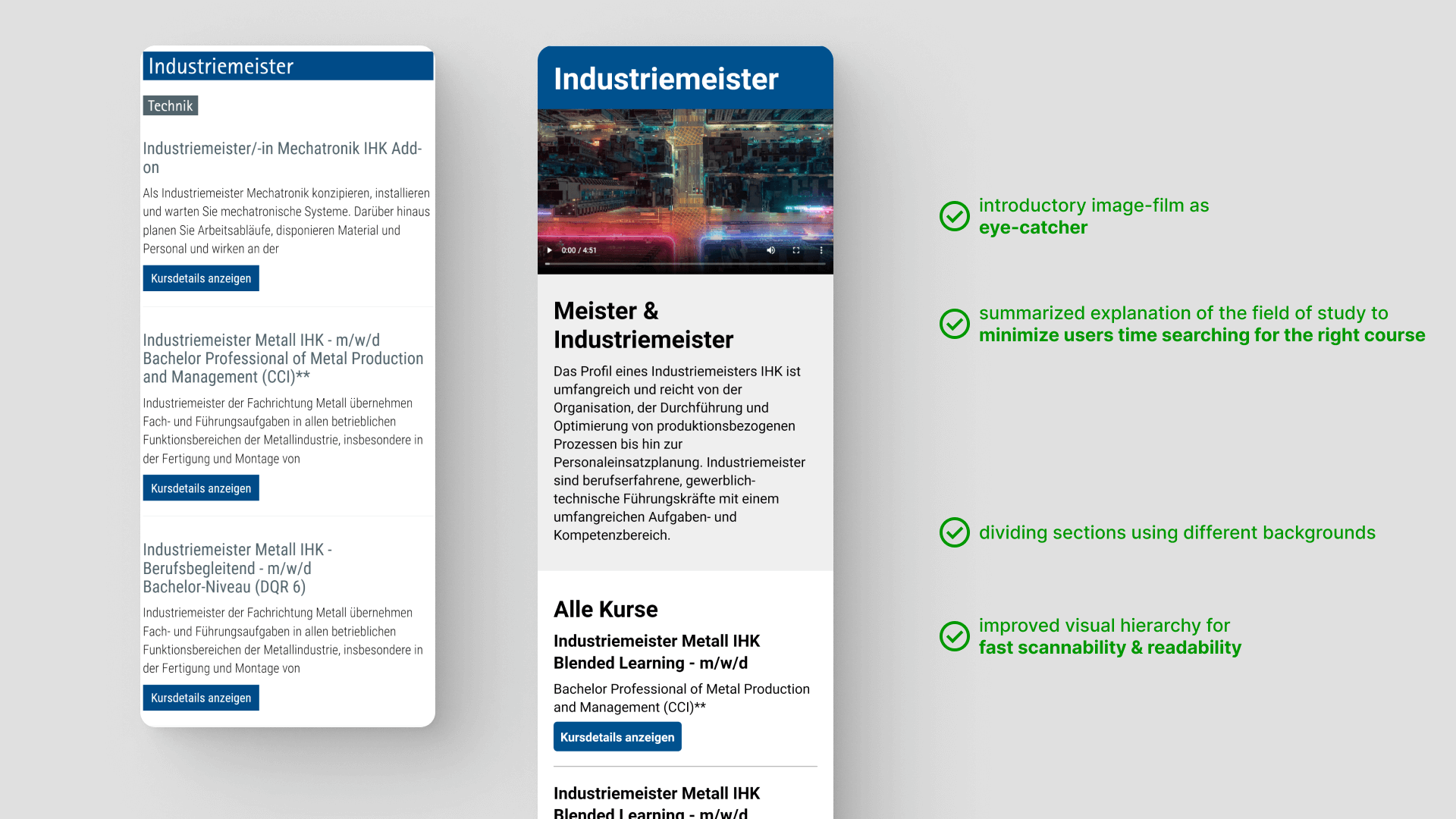
Overview page
Initially the overview page was just a list of all programs with contact links and a news section below. To better guide users on their journey to find the right program, the new design introduces each program category with an engaging image film and a summary to inform interested students about each fields of study. This way users are able to scan the content with more ease and reach the right program faster.
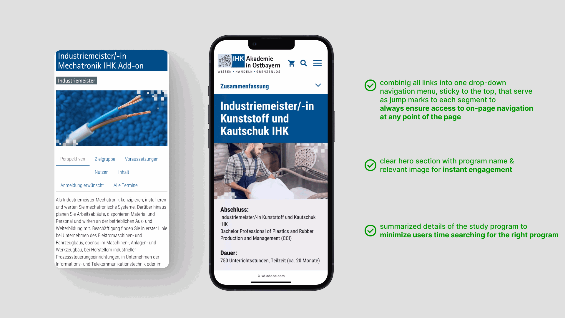
Detail page - navigation
The redesign of the on-page navigation utilizes a sticky drop-down navigation menu, which offers several advantages. Firstly, it ensures easy access to navigation options as users scroll through content, enhancing overall usability. Secondly, it optimizes screen space by providing a compact yet accessible navigation solution. Additionally, the sticky behavior maintains consistency and familiarity for users, facilitating seamless navigation across different sections of the website. Lastly, it improves user engagement and retention by offering convenient access to key navigation options without interrupting the browsing experience.
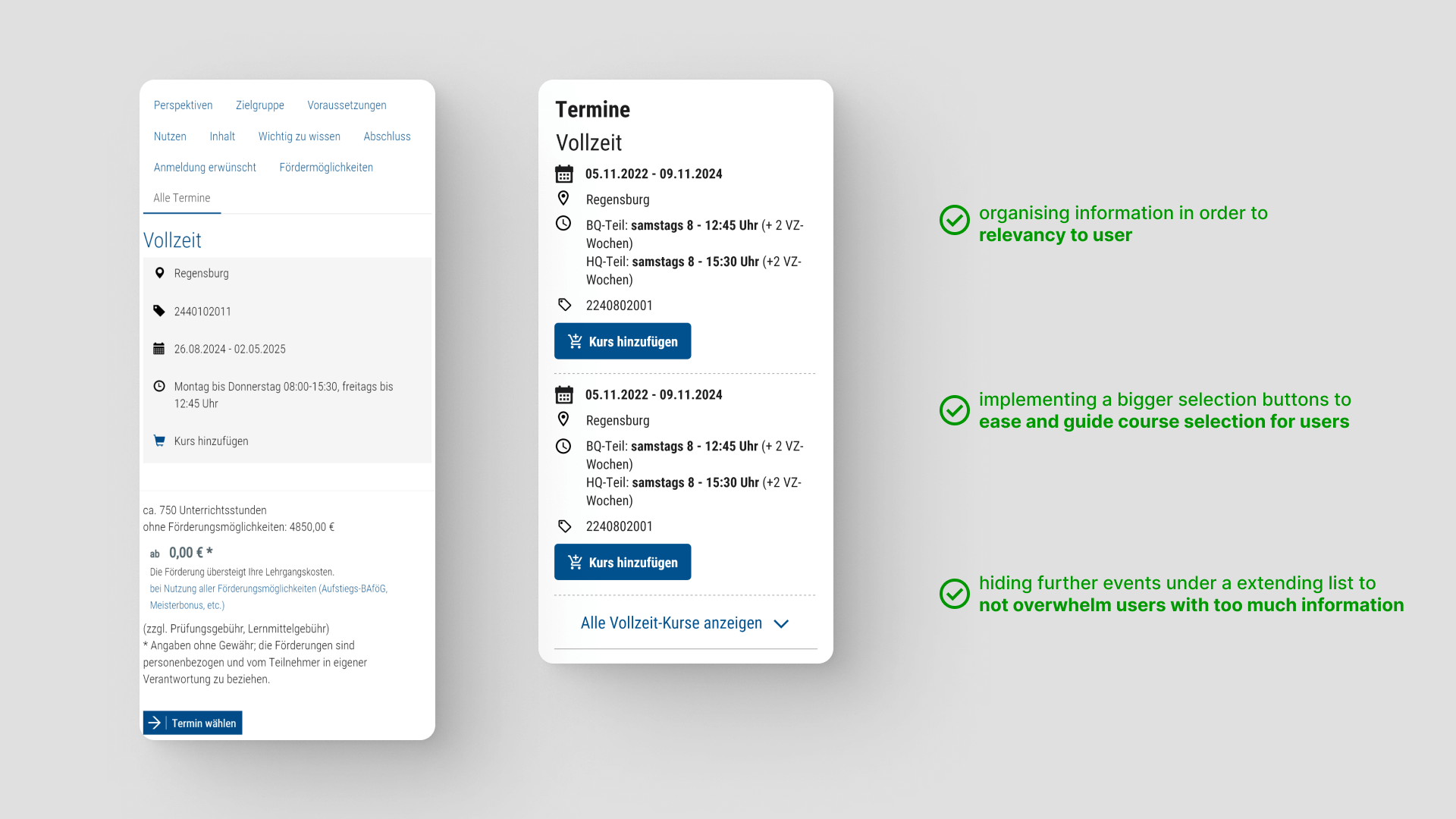
Dates
Each date element was restructured to keep the focus on time and place with an individual CTA button to make the course selection easier. Full- and part-time programs are split into two sections by extra sub headlines, which are limited to two elements to leave the user with the decision to find out more information if interested.
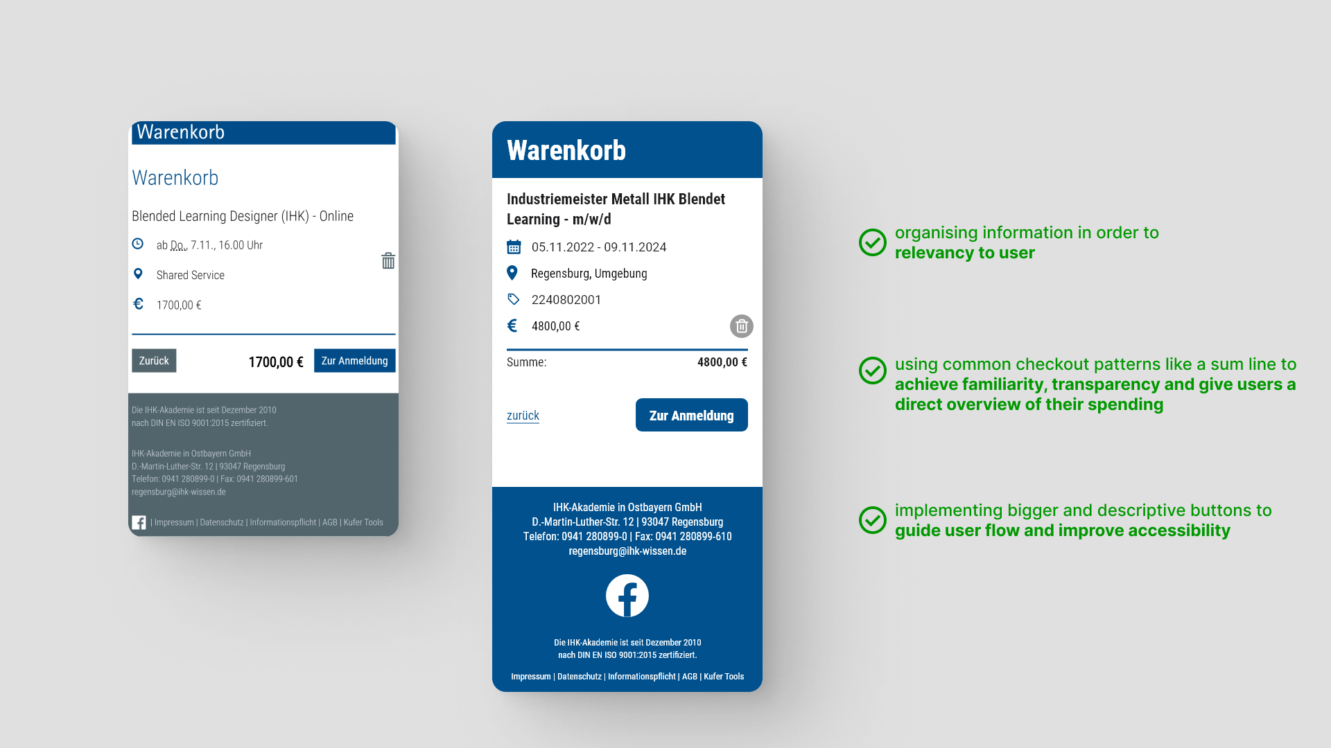
Registration process
shopping cart -> registration form -> summary page -> confirmation page
The improved dates structure was also applied to the shopping cart with the addition of a sum line to display the total cost.
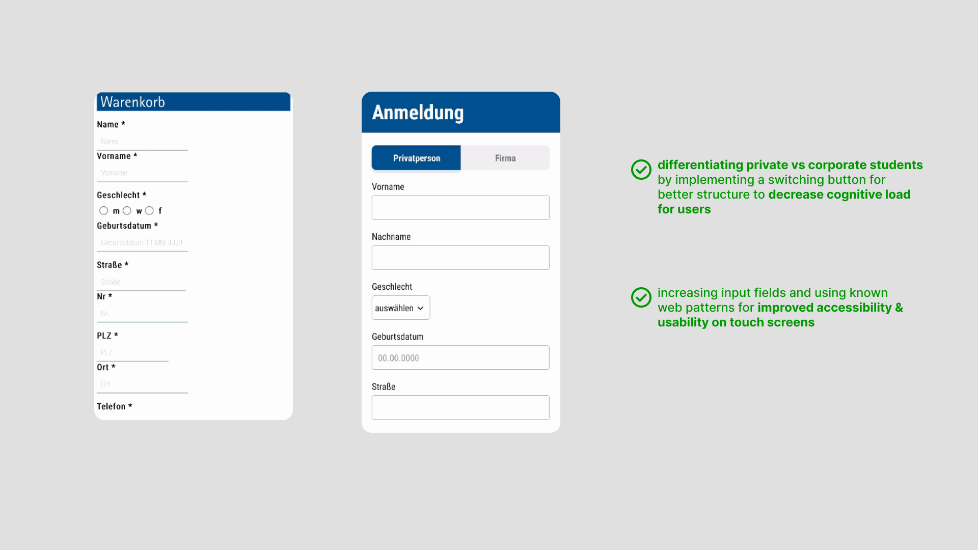
Initially the whole registration form suffered from an unstructured and drawn-out layout. Therefore the same styling from the contact form was also applied here. In order to minimize page length and better help different user groups, a switch button for private and corporate applicants was introduced.
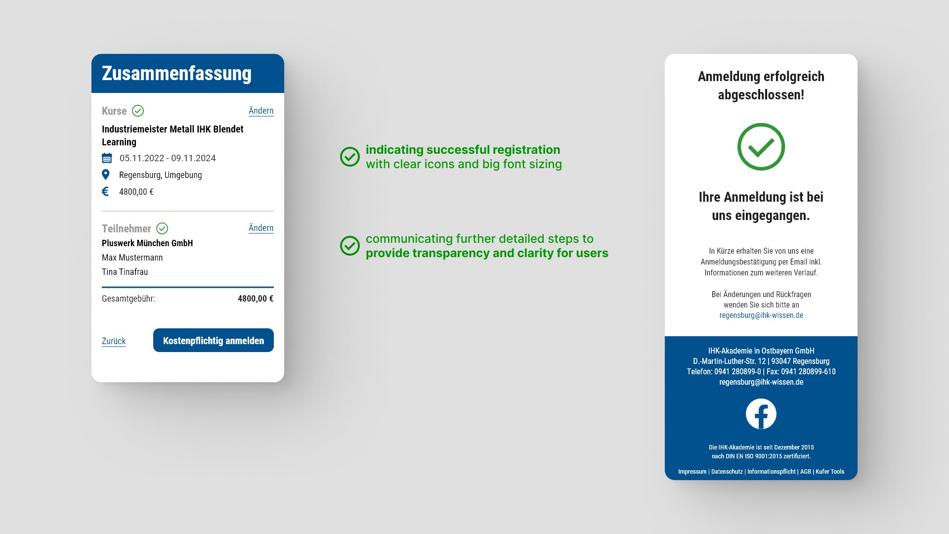
After filling out the registration form, students are able to review their purchase on the summary page. The button text "register with costs" clearly communicates to the applicant, that they are about to finish the registration process.
The confirmation page explains the next steps to follow, such as a confirmation email, which is sent to the applicant, and also the possibility for additional contact for further questions.
Result evaluation
After two feedback rounds with the client and product manager, we presented our final design in the form of an interactive protoype within Adobe XD to the client. We were able to show case the user journey, starting from the home page to the final confirmation page.
The client expressed strong enthusiasm for our design, indicating their favorable impression and intention to discuss further collaborations and extension of the project.
Review & Outlook
Even though we were able to complete our project objectives and win over the clients approval, there are areas of this project, which still leave room for a more detailed exploration, if we would have had the necessary time and recources:
Measuring project impact:
Exploring interaction design solutions:
Expanding the mobile design to a desktop version: